节点数据模板
任何节点或链接的外观不仅取决于它所绑定的数据,还取决于用于定义其可视树元素的 DataTemplate。 数据模板是可重用的 XAML 片段,它定义了如何显示绑定的数据。 因此,图表的外观与代码是分开的。 只需编辑定义节点或链接的 XAML 即可更改图表的外观。
由于节点和链接是由 XAML 定义的,因此很容易将 WPF 图形(矩形、文本、路径、渐变、图像甚至视频)的所有功能合并到您的图表中,包括使用动画、故事板和模糊等效果 和投影。
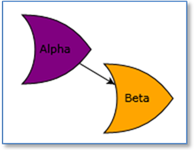
使用这个 NodeTemplate 节点可以很简单
    <DataTemplate>
      <TextBlock Text="{Binding Path=Data}" />
    </DataTemplate>
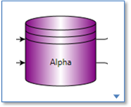
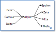
但也可以根据您的需要定义复杂的节点(单击图像查看 XAML)
      <DataTemplate x:Key="NodeTemplate4">
        <!-- a NodePanel shows a background shape and places the other panel children inside the shape -->
        <go:NodePanel go:Node.SelectionAdorned="True"
                      go:Node.ToSpot="LeftSide" go:Node.FromSpot="RightSide" >
          <go:NodeShape go:NodePanel.Figure="Database" Stroke="Black" StrokeThickness="1">
            <Shape.Fill>
              <!-- use a fancier brush than a simple solid color -->
              <LinearGradientBrush StartPoint="0.0 0.0" EndPoint="1.0 0.0">
                <LinearGradientBrush.GradientStops>
                  <GradientStop Color="{Binding Path=Data.Color,
                          Converter={StaticResource theStringColorConverter}}" Offset="0.0" />
                  <GradientStop Color="White" Offset="0.5" />
                  <GradientStop Color="{Binding Path=Data.Color,
                          Converter={StaticResource theStringColorConverter}}" Offset="1.0" />
                </LinearGradientBrush.GradientStops>
              </LinearGradientBrush>
            </Shape.Fill>
          </go:NodeShape>
          <!-- this TextBlock element is arranged inside the NodePanel’s shape -->
          <TextBlock Text="{Binding Path=Data.Key}" TextAlignment="Center"
                     HorizontalAlignment="Center" VerticalAlignment="Center" />
        </go:NodePanel>
      </DataTemplate>
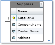
    <DataTemplate x:Key="NodeTemplate" >
      <go:NodePanel go:Node.SelectionAdorned="True" >
        <Border Background="Azure" BorderBrush="Black" BorderThickness="1" MaxWidth="200" >
          <Grid MaxWidth="200">
            <Grid.RowDefinitions>
              <RowDefinition Height="Auto" />
              <RowDefinition Height="Auto" />
            </Grid.RowDefinitions>
            <Grid Grid.Row="0" >
              <Grid.ColumnDefinitions>
                <ColumnDefinition Width="*" />
                <ColumnDefinition Width="Auto" />
              </Grid.ColumnDefinitions>
              <TextBlock Grid.Column="0" Text="{Binding Path=Data.Name}" FontWeight="Bold"
                         TextAlignment="Left" TextWrapping="Wrap" Margin="4 4 4 2" />
              <Border Grid.Column="1" BorderBrush="Black" BorderThickness="2"
                      Height="34" Margin="2"
                      Width="{Binding Path=Data.Flag,
                              Converter={StaticResource theImageSizeConverter}}">
                <Image Stretch="Fill" Source="{Binding Path=Data.Flag}" />
              </Border>
            </Grid>
            <TextBlock Grid.Row="1" Text="{Binding Path=Data.PersonData}"
                       TextAlignment="Left" TextWrapping="Wrap" Margin="4 4 4 2" />
          </Grid>
        </Border>
      </go:NodePanel>
    </DataTemplate>
  <DataTemplate x:Key="NodeTemplate">
    <Border Background="Gray" BorderBrush="Gray" BorderThickness="2" CornerRadius="3"
            go:Part.SelectionAdorned="True" go:Part.Resizable="True"
            go:Node.FromSpot="AllSides" go:Node.ToSpot="AllSides"
            go:Node.Location="{Binding Path=Data.Location, Mode=TwoWay}">
      <Grid>
        <Grid.RowDefinitions>
          <RowDefinition Height="Auto" />
          <RowDefinition Height="*" />
        </Grid.RowDefinitions>
        <Grid Grid.Row="0">
          <Grid.ColumnDefinitions>
            <ColumnDefinition Width="*" />
            <ColumnDefinition Width="Auto" />
          </Grid.ColumnDefinitions>
          <TextBlock Grid.Column="0" HorizontalAlignment="Center"
                     Text="{Binding Path=Data.Key}" FontWeight="Bold" />
          <Button Grid.Column="1" Content="*" Click="Button_Click" />
        </Grid>
        <ListView Grid.Row="1" Background="White" HorizontalAlignment="Stretch"
                  ItemsSource="{Binding Path=Data.Items}">
          <ListView.View>
            <GridView>
              <GridView.Columns>
                <GridViewColumn>
                  <GridViewColumn.CellTemplate>
                    <DataTemplate>
                      <go:NodeShape
                          go:NodePanel.Figure="{Binding Path=Figure}"
                          Width="10" Height="10"
                          Fill="{Binding Path=Color,
                                 Converter={StaticResource theStringBrushConverter}}"
                          Stroke="Black" StrokeThickness="1" />
                    </DataTemplate>
                  </GridViewColumn.CellTemplate>
                </GridViewColumn>
                <GridViewColumn Header="Name"
                                DisplayMemberBinding="{Binding Path=Name}" />
              </GridView.Columns>
            </GridView>
          </ListView.View>
        </ListView>
      </Grid>
    </Border>
  </DataTemplate>
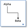
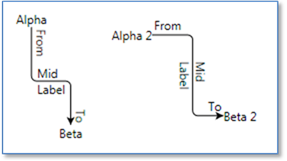
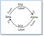
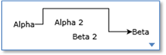
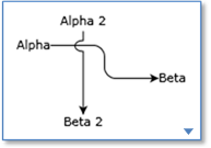
链接的数据模板
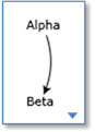
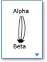
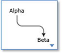
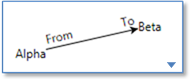
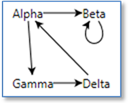
GoXam 还支持链接的 DataTemplate,以及正交、贝塞尔、圆角、跳转和避免节点路由等链接功能。 (点击图片查看 XAML)
    <DataTemplate x:Key="LinkTemplate2">
      <go:LinkPanel go:Part.SelectionElementName="Path"
                    go:Part.SelectionAdorned="True" >
        <go:LinkShape x:Name="Path" go:LinkPanel.IsLinkShape="True"
                      Stroke="Black" StrokeThickness="1" />
        <!-- the arrowhead -->
        <Polygon Fill="Black" Points="8 4  0 8  2 4  0 0"
                 go:LinkPanel.Alignment="1 0.5" go:LinkPanel.Index="-1"
                 go:LinkPanel.Orientation="Along" />
      </go:LinkPanel>
    </DataTemplate>
  <DataTemplate x:Key="LinkTemplate4">
    <go:LinkPanel go:Part.SelectionElementName="Path"
                  go:Part.SelectionAdorned="True">
      <go:Link.Route>
        <go:Route Routing="Orthogonal" />
      </go:Link.Route>
      <go:LinkShape x:Name="Path" go:LinkPanel.IsLinkShape="True"
                    Stroke="Black" StrokeThickness="1" />
      <Polygon Fill="Black" Points="8 4  0 8  2 4  0 0"
               go:LinkPanel.Alignment="1 0.5" go:LinkPanel.Index="-1"
               go:LinkPanel.Orientation="Along" />
    </go:LinkPanel>
  </DataTemplate>
    <go:Link.Route>
      <go:Route Curve="Bezier" />
    </go:Link.Route>
使用避免节点
用 Jumpovers 四舍五入
    <go:Link.Route>
      <go:Route Routing="AvoidsNodes" />
    </go:Link.Route>
    <go:Link.Route>
      <go:Route Routing="Orthogonal" Curve="JumpOver" Corner="10" />
    </go:Link.Route>